Overview
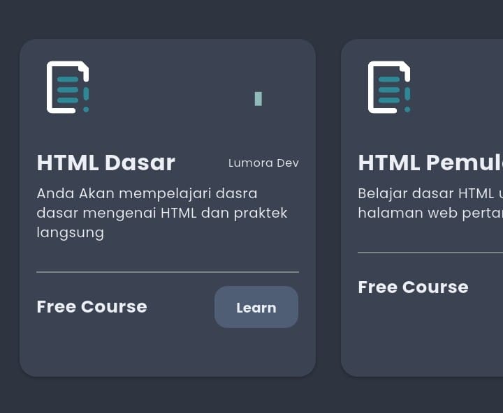
Course Card A simple and elegant Flutter widget template designed to help you build course-based UI components quickly and efficiently.
Features
- Navigation Button
- Learning Icons
- Difficulty Indicators
- Title and Description Section
- Pricing Information
Properties
| Property | Type | Description | Example |
|---|---|---|---|
| icondifficulty | IconData | Icon that represents the course difficulty level or type. |
Icons.signal_cellular_alt
|
| colorsific | Color | Accent color associated with the difficulty or theme of the course. |
Colors.amberAccent
|
| judulkursus | String | The course title displayed on the card. |
'Nama Kursus'
|
| pemilikkursus | String | The course owner, author, or instructor name. |
'Nama'
|
| deskripsi | String | A short description or summary of the course content. |
'Lorem Ipsum'
|
| targethalaman | Function() | Callback function triggered when the card is tapped or interacted with. Can be used for navigation. |
() => debugPrint('Test')
|
Example Navigation Usage
targethalaman: () => Navigator.push(
  context,
  MaterialPageRoute(builder: (_) => DetailPage()),
),
How to Use
If Installed Manually
Import the Dart file into your project:
import 'package:Folderfile/Course_Card.dart';
If Installed via GitHub/Dependencies
1. Import the package:
import 'package:course_card/course_card.dart';
2. Use the widget:
      Cardkursus(
        icondifficulty: Icons.signal_cellular_alt,
        colorsific: Colors.amberAccent,
        judulkursus: 'Nama Kursus',
        pemilikkursus: 'Nama',
        deskripsi: 'Lorem Ipsum',
        targethalaman: () => debugPrint('Test'),
      );
Visual Preview
IMAGE 1
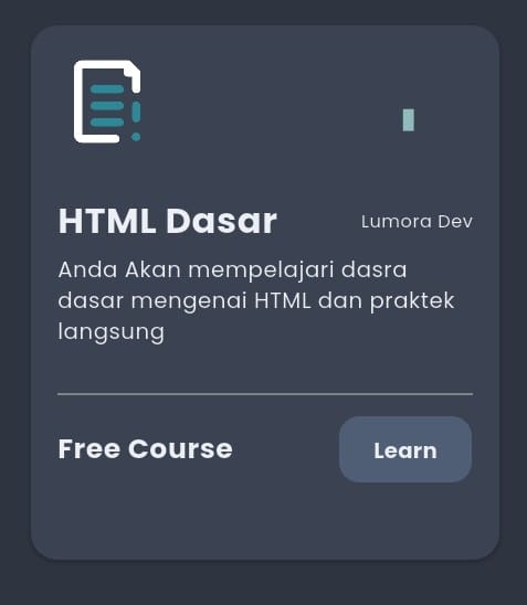
IMAGE 2
Integration
- Tambahkan gambar di
pubspec.yaml. - Panggil widget di halaman Flutter manapun.
Version History
Version 0.1.0 (Beta)
- First Release